HOOX FISHING.
RE-BRAND.
LOGO REFINEMENT AND FINESSE.
BRAND DEVELOPMENT.
When we started working with HOOX, they were in the early days of their start-up. Still figuring things out and trying to get seed investment. They came to us to look at where they were and suggest ways to elevate them.

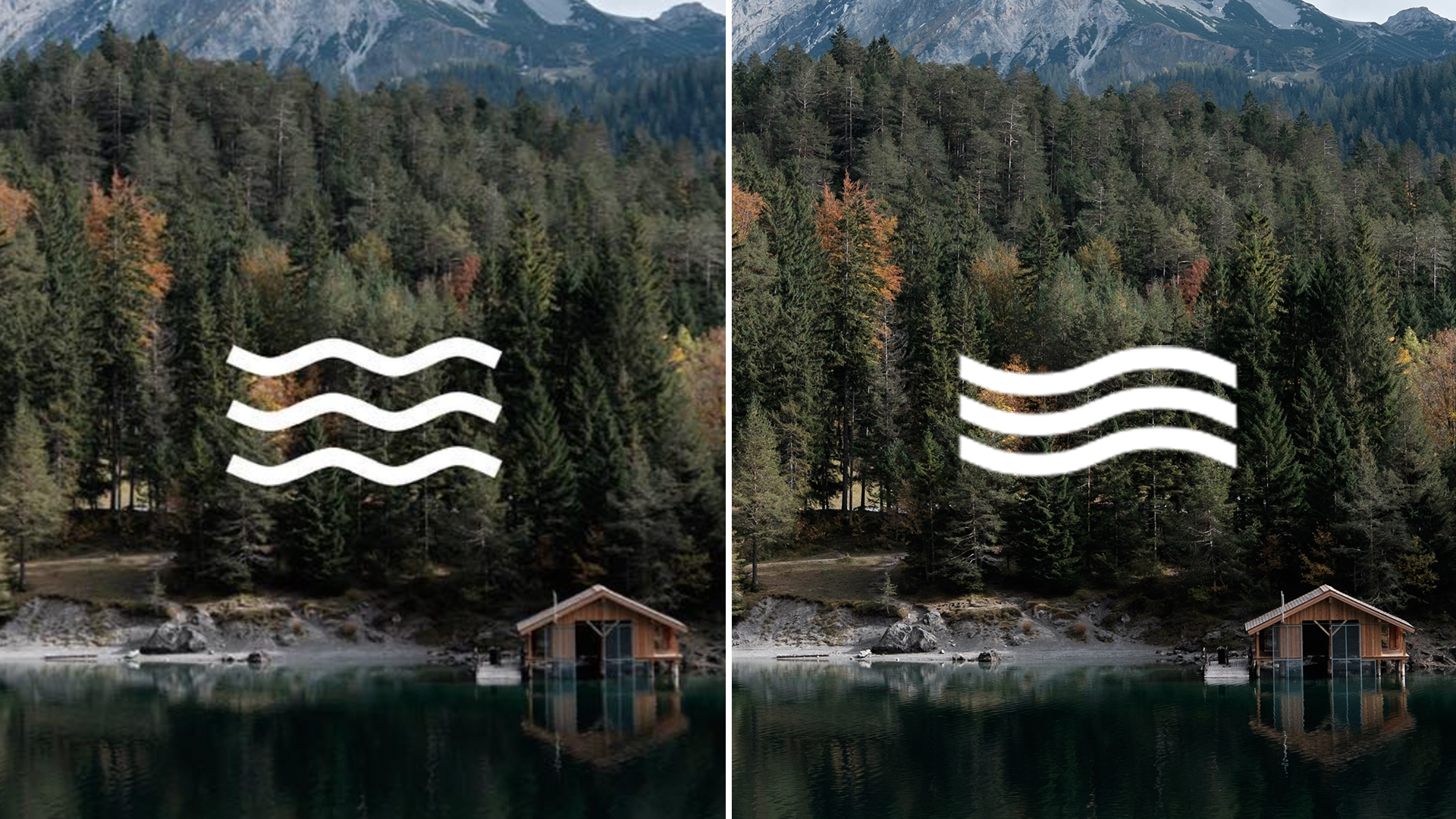
Before (left) // After (right)
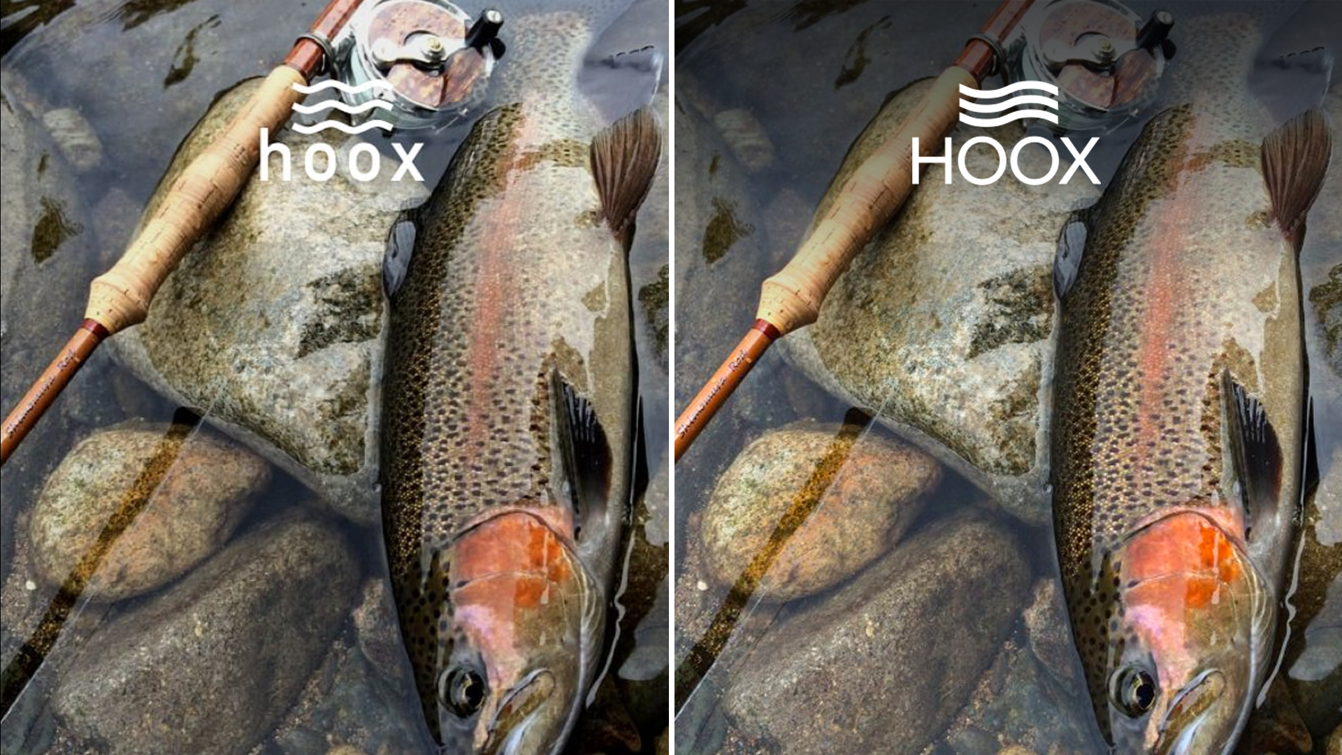
First job, their logo. It was ok. But looked a bit rushed. We took some time and pulled it into shape with the smoother waves, the use of tight kerning and capital letters and for a stronger look and generally better balance.

Before (left) // After (right)
We also suggested a naming convention; the addition of other four-letter words underneath the main brand to tie in with areas of their business.


We were mindful of the risk of painting them into a corner with this.
But, with plenty of words to choose from – crew to club, gear to wear (and loads more) there’s always a word that fits their brand and it’s an approach they still use today.


